
May 6,
2015
Every so often, the research team here at Ecofiscal will venture out into the blogosphere. Sometimes, we’ll share additional analysis that didn’t quite make it to a report. Sometimes, we’ll elaborate on more technical ideas or data that the main reports consider only briefly. And sometimes, we’ll just take the opportunity to be unabashedly #wonkish. So be warned: here be graphs.
In the last few blogs, we’ve talked about key design choices for carbon pricing policy like stringency and coverage. Together, those factors help define the scope for a third dimension: revenue recycling.
It’s worth emphasizing that the primary objective of designing a carbon pricing policy should be to reduce carbon emissions. Revenue generation is secondary. But how governments use that revenue is pretty important. If used wisely, it can lead to additional economic benefits. (And if not, it can be the policy’s undoing).
But first, how much money are we talking about here? This question matters quite a lot for governments considering carbon-pricing policies.
Carbon revenue depends on several factors, and in particular, the design of the carbon pricing policy. Let’s take a look via a simple calculation. (Why use words when we can use math instead? Kidding, kidding… kind of).
Think of it this way: total revenue in a given year is equal to the market price of carbon in that year multiplied by the priced emissions—the emissions on which emitters pay the carbon price. Put another way:
Total revenue = (carbon price) x (priced emissions)
We’ve talked about both of these factors in the context of stringency and coverage already. But a little more unpacking is required to determine which emissions are actually priced. The figure below is a useful way of thinking about this quantity of emissions.
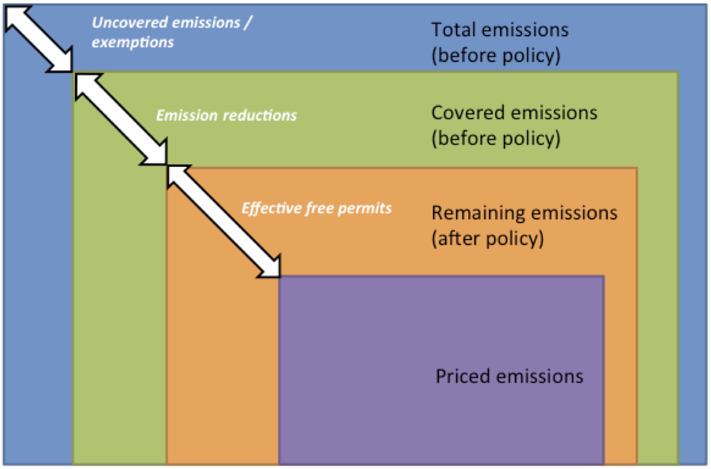
The figure illustrates that of all total emissions (the blue box), emitters pay the carbon price only on a subset of these emissions. A few factors define this share of priced emissions:
First, only some fraction of total emissions is covered by the policy (the green box). That is, the policy creates incentives to reduce these emissions. In BC, for example, fossil fuel combustion emissions are covered, but process emissions are uncovered. In Alberta, only large emitters are covered, exempting smaller ones. In Quebec, waste management and agriculture emissions are outside of the cap.
Second, emitters avoid paying for some emissions by taking action to reduce them (which is the whole point of the policy). Only the remaining emissions (orange box) are left to generate revenue.
And finally, whether these remaining emissions actually do generate revenue depends on the extent to which policy prices all emissions. The BC carbon tax prices all remaining emissions. The Alberta SGER only prices emissions above a given intensity threshold, which has a similar effect as providing free allocations. The Quebec cap-and-trade system does provide free permits for emissions-intensive and trade-exposed industries as well as for process emissions. The residual priced emissions (purple box) generate revenue.
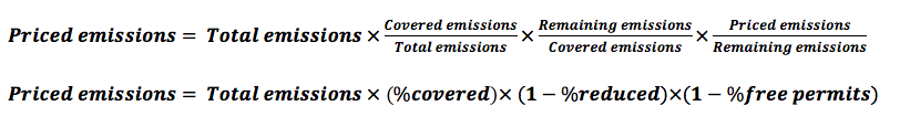
Overall, priced emissions could therefore be calculated as:
 Based on our assessments of the BC, Alberta, and Quebec carbon pricing policies, we can estimate these key parameters; see our report’s infographic for details.
For governments estimating potential future revenue, the dynamics of the story is the missing piece. How will emitters respond to the price by reducing emissions? After all, the whole point of a carbon price is to encourage emissions reductions. And at the same time, how will changes in policy design over time affect total revenue? Smart carbon pricing policy design is transitional: the stringency should start low to avoid shocking the economy, but increase gradually and steadily over time to drive long-term emissions reductions. Quebec’s minimum carbon price is rising over time, just as the share of free permits in Quebec will decline.
Ontario has indicated that it will implement a cap-and-trade system by joining Quebec and California under the Western Climate Initiative. So just for fun, let’s apply our simple model to consider how much revenue might be generated in Ontario.
We need to make some assumptions about design to make our estimate. Let’s assume that Ontario generally follows Quebec’s lead. Assume:
Based on these assumptions, revenue from the policy over time would look something like the figure below.
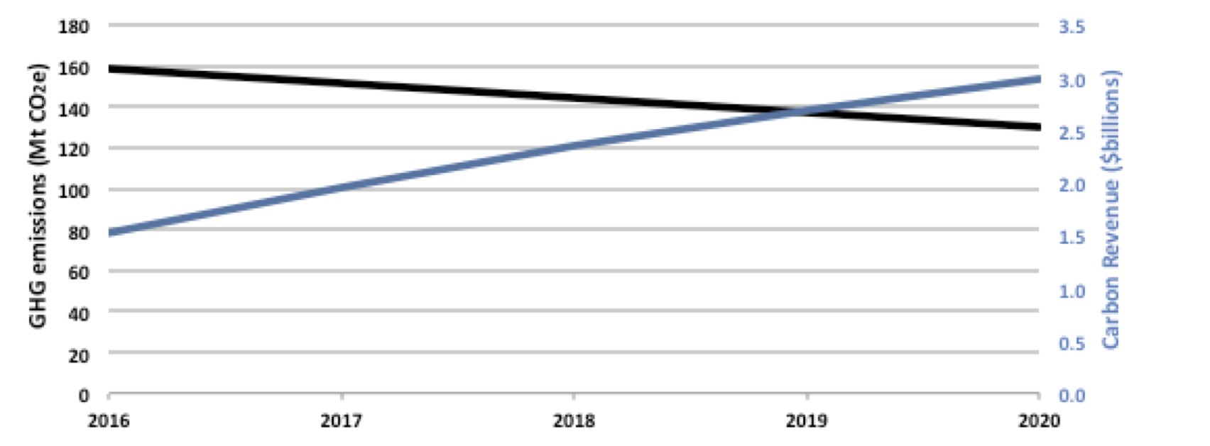
The blue line represents estimated carbon pricing revenue while the black line Ontario’s emissions trajectory to meet its 2020 target. Interestingly, while emissions fall, the increasing carbon price and the rising percentage of auctioned permits overwhelm this effect, therefore increasing yearly revenue. Our coarsely estimated carbon revenue for Ontario gives $1.5 billion in 2016 and $3 billion in 2020.
How does this compare with carbon revenue generation from existing provincial carbon pricing policies? BC’s carbon tax raised $1.2 billion in 2014; Quebec’s cap-and-trade’s 2015 revenue from auctioning is projected at $425 million. By contrast, Alberta’s system generated only $55 million in 2012, due to its lower share of priced emissions.
If we use Ontario’s 2016 estimated revenue as a benchmark, we can use provincial emissions and the two determinants explained above (the carbon price and the percent of priced emissions) to explain the differences in provincial carbon revenue numbers.
BC’s and Ontario’s revenue number look quite similar, but hide important differences. BC’s absolute GHG emissions are less than 40% of Ontario’s. However, BC’s carbon price is twice the estimated price for Ontario. Also, BC’s priced emissions are higher than assumed for Ontario, given that all covered emissions are paid for under the carbon tax.
While having the same carbon price and likely the same percentage of priced emissions, Quebec’s revenue is less mostly because the province emits only about half of Ontario GHG emissions.
The story for Alberta is the opposite. The province’s emissions are close to 1.5 times that of Ontario’s. While the carbon price is the same, the percentage of priced emissions in Alberta is much smaller because of the intensity threshold which effectively provides mostly free allocations.
So you can see, figuring out the scale of revenue governments can generate through carbon pricing policies is fairly complex. But figuring out how to use that revenue—well, that’s an even hairier challenge.
Depending on their priorities, different provinces have chosen different revenue recycling options. BC has decided to make its policy revenue neutral by reducing corporate and personal income taxes. Quebec is investing in the expansion of public transit, green energy and other GHG reducing projects. Alberta on the other hand is funding low-carbon innovation and technological projects. Ontario is suggesting that it will fund household energy efficiency, public transit and GHG reduction projects for businesses (similar to Quebec).
So is one of these choices better than the others? All can result in economic benefits (if done right) but they all have trade-offs too. Unfortunately, there’s no simple (or even super complicated) math equation that can pump out the “right” answer. What makes sense in one place, may not make sense in another. The right choice has as much to do with local needs, values, and perspectives as it does with cold, hard numbers. This is where social meets science—and where policymakers have their work cut out for them. Us too. Stay tuned.


1 comment
A couple of more numbers regarding Ontario:
Ontario GDP 2016E = $725 bn
Ontario Tax Revenue 2016E = $129 bn
Ontario Deficit 2015E = $4.5 bn
Ontario Student Grants 2015E = $1.3 bn
So if Ontario decides to collect $1.5 bn in carbon tax fees in 2016 then:
> carbon tax represent 0.2% of Ontario GDP
> carbon tax represents 1.1% of total Ontario tax collection
> carbon tax represents 33% of Ontario budget deficit
> carbon tax represents just more than what Ontario spends on total student grants
At these levels the carbon tax will hardly be noticeable to the Ontario GDP and with tax collection. However, it could make a huge difference in improving the Ontario budget deficit and/or in say student grants.
It makes complete sense for Ontario to use the money to help in reducing the deficit and in getting the secondary environmental effect of reducing emissions by investing more in transportation and alternative energies. That would be the responsible thing to do with the money.
Comments are closed.